Cocktail Lounge

Welcome to Dioniso, where elegance intertwines with the intoxicating allure of the divine. Inspired by the Greek god Dionysus—the deity of revelry, indulgence, and the finer pleasures of life, our cocktail lounge offers an experience that transcends the ordinary. This is where smoke curls and dances through the air, where each drink is a crafted symphony of flavour, and where every moment invites you to surrender to the senses.

Project partner: Jennifer Mastromonaco
Jennifer and I collaborated on this project to create the brand identity for Dioniso. She designed the letterhead and envelope for the stationery items, as well as the coasters, stickers, cocktail mixer labels for promotional items, and posters for our guerrilla marketing campaign.

Project Brief

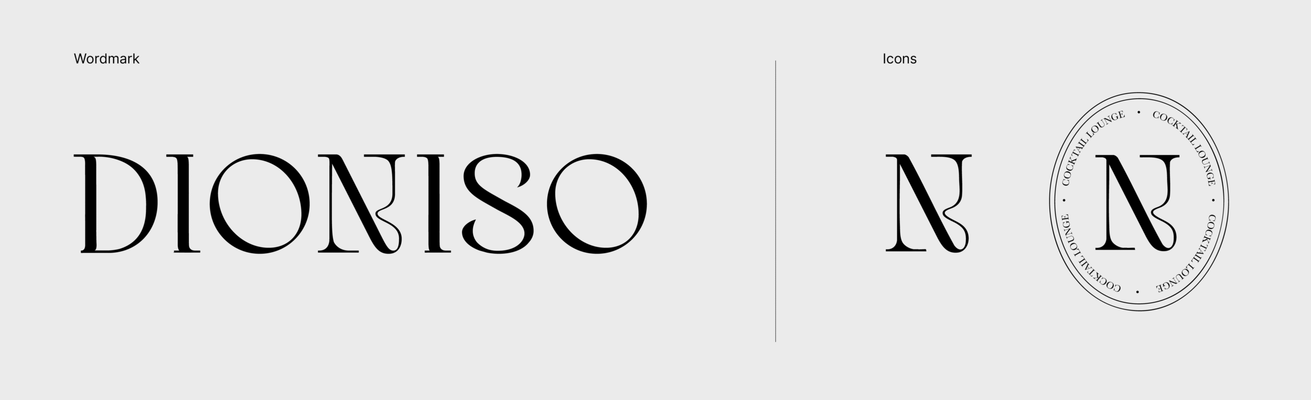
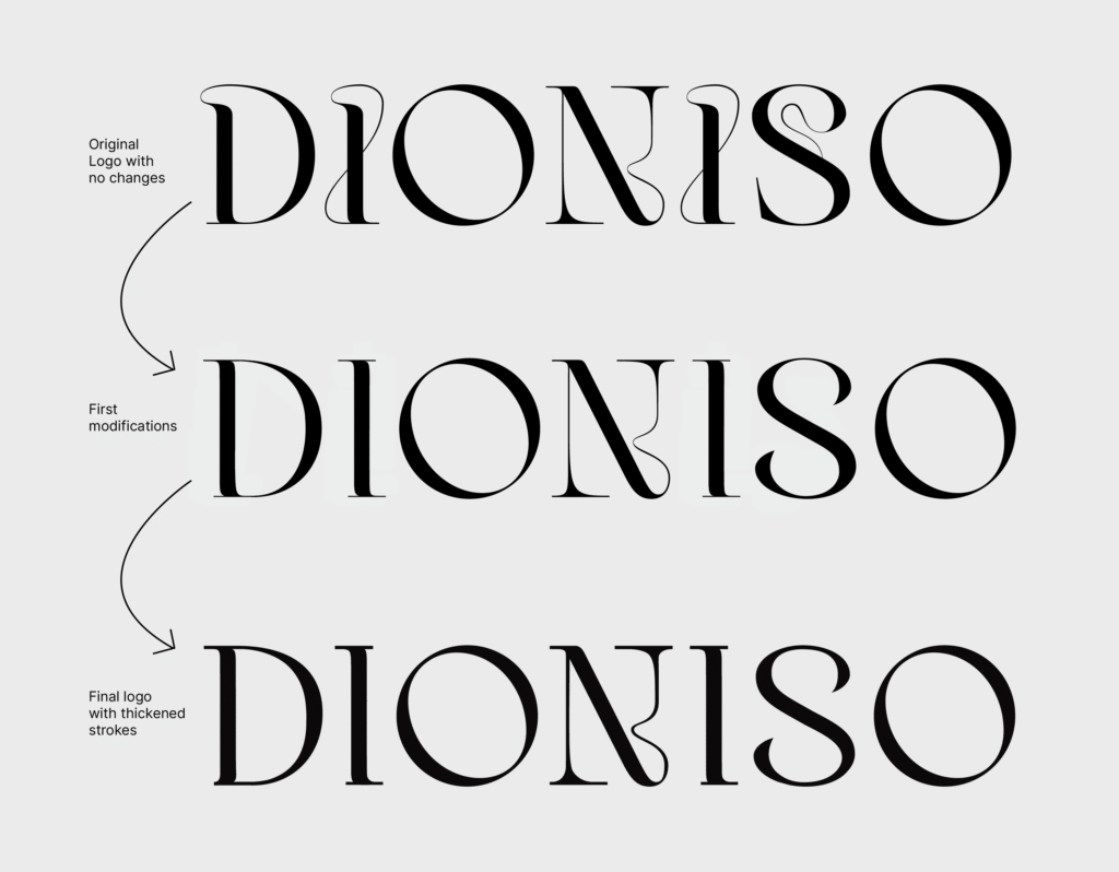
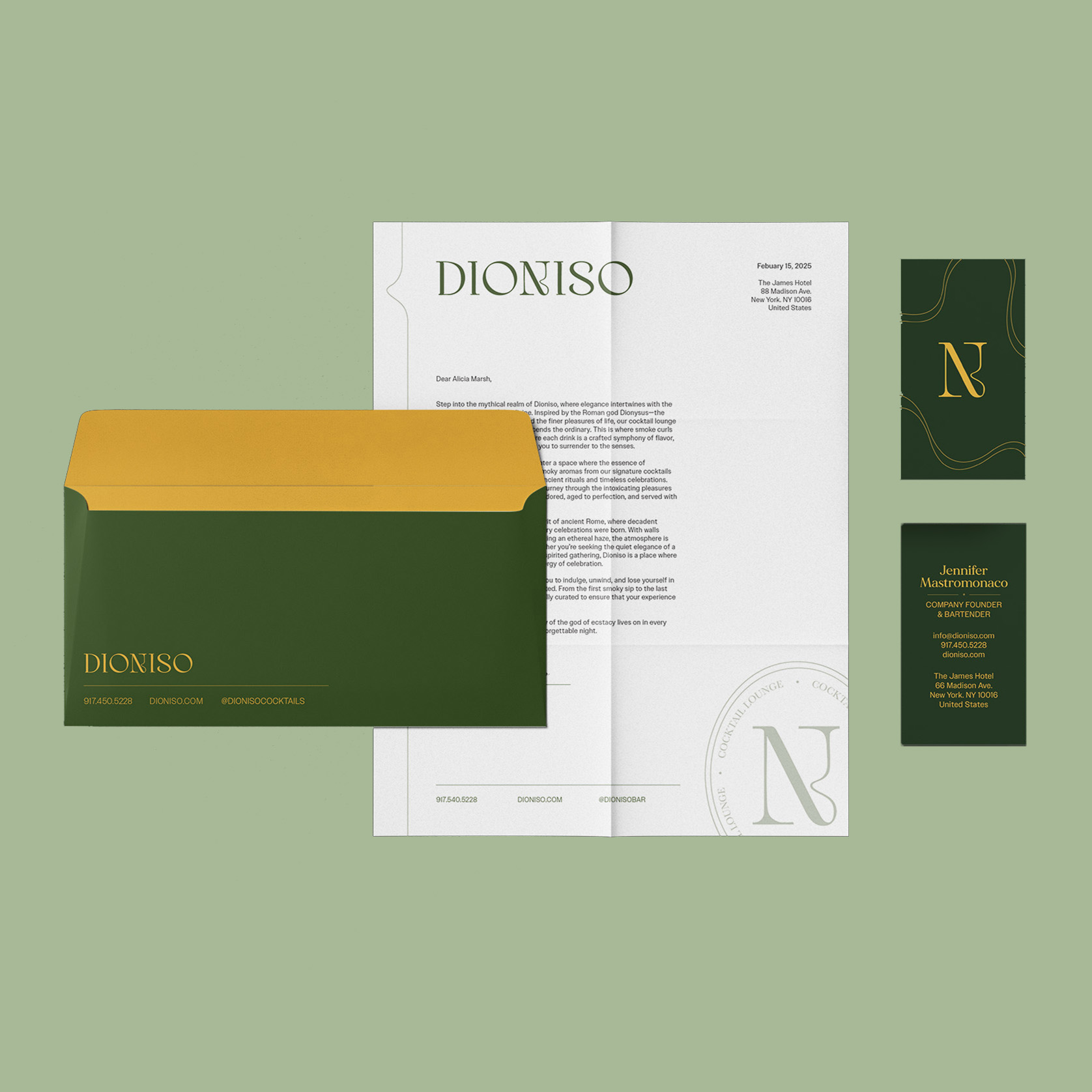
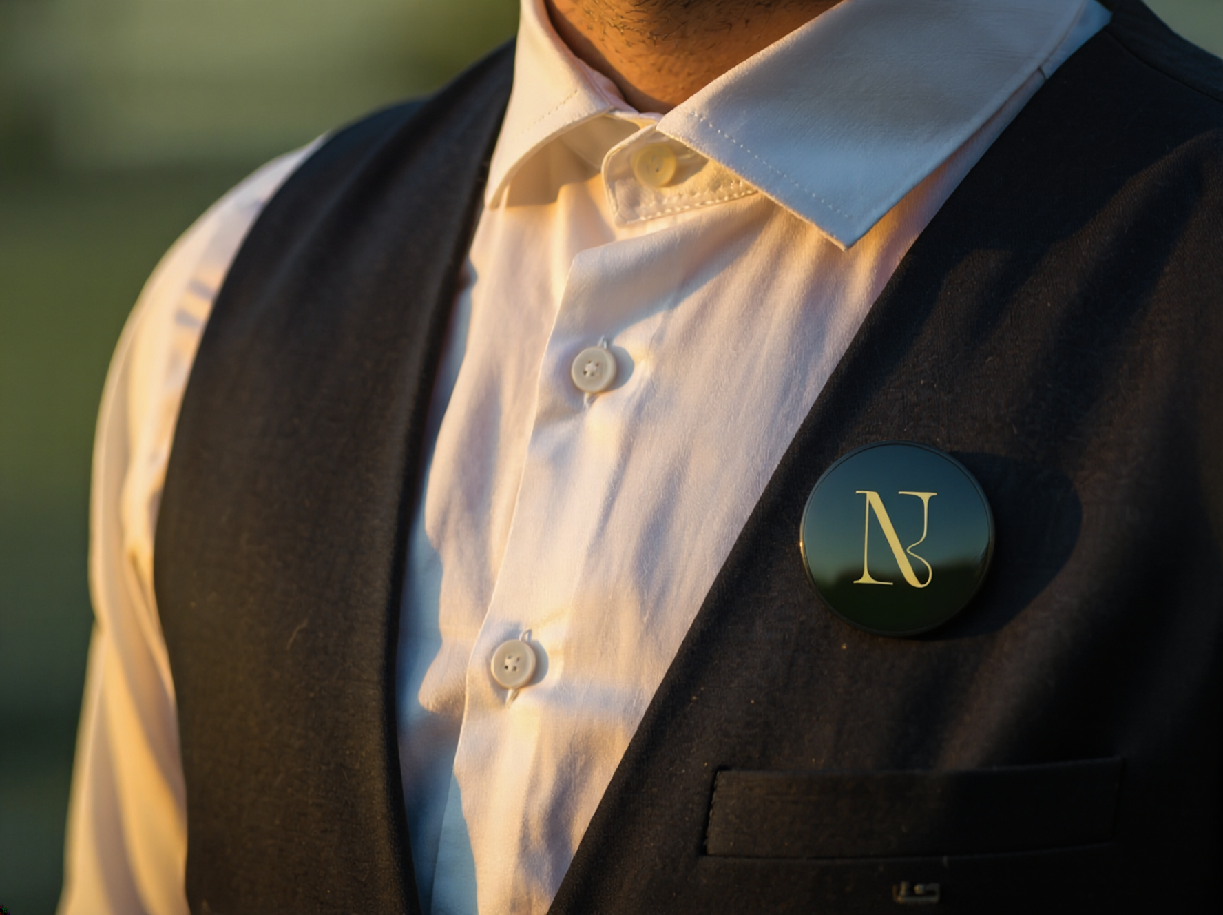
Over the course of an entire semester, Jennifer and I learned the skills needed to create a brand. We learned how to curate a brand’s personality and raise brand awareness through marketing basics on advertising materials and consumer psychology. A large portion of our efforts was devoted to creating professional visuals and typography, including a logo, guidelines, stationery set, promotional items, and an ad campaign, all consistent with our brand recognition. 

Brand Concept

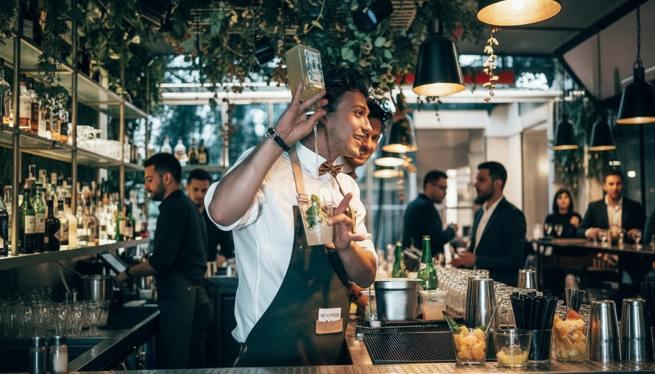
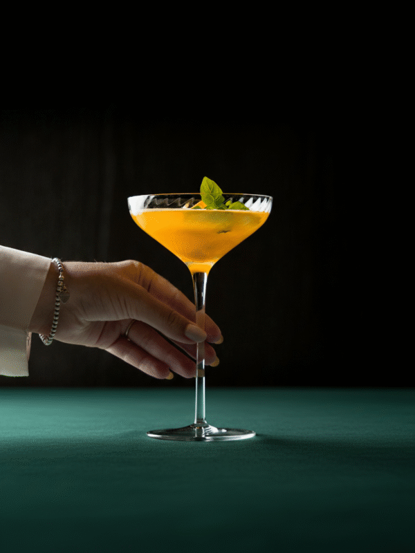
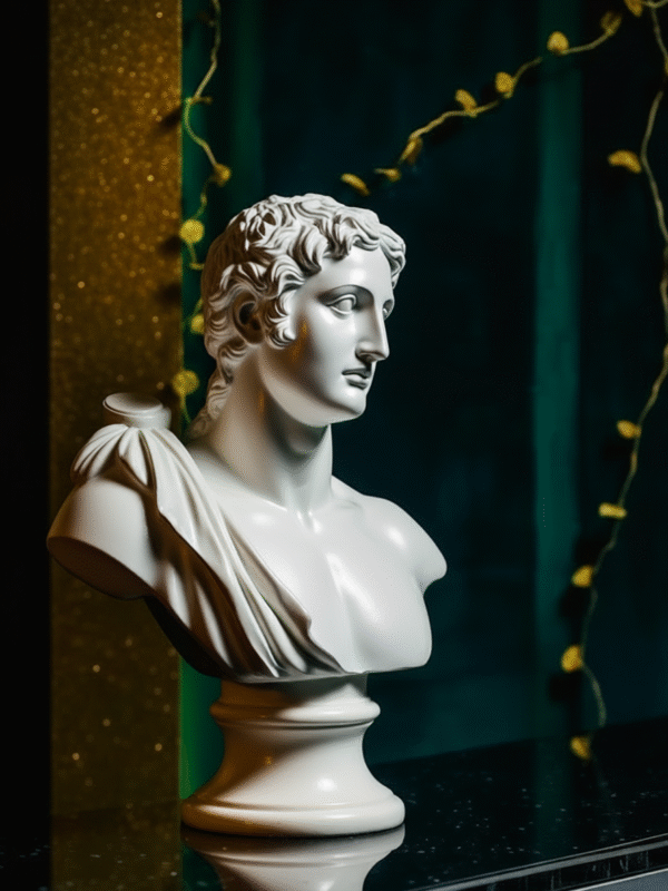
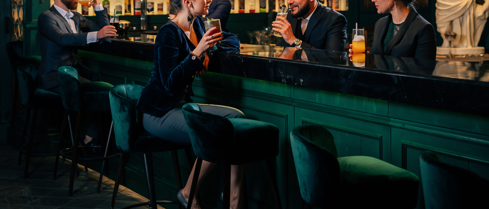
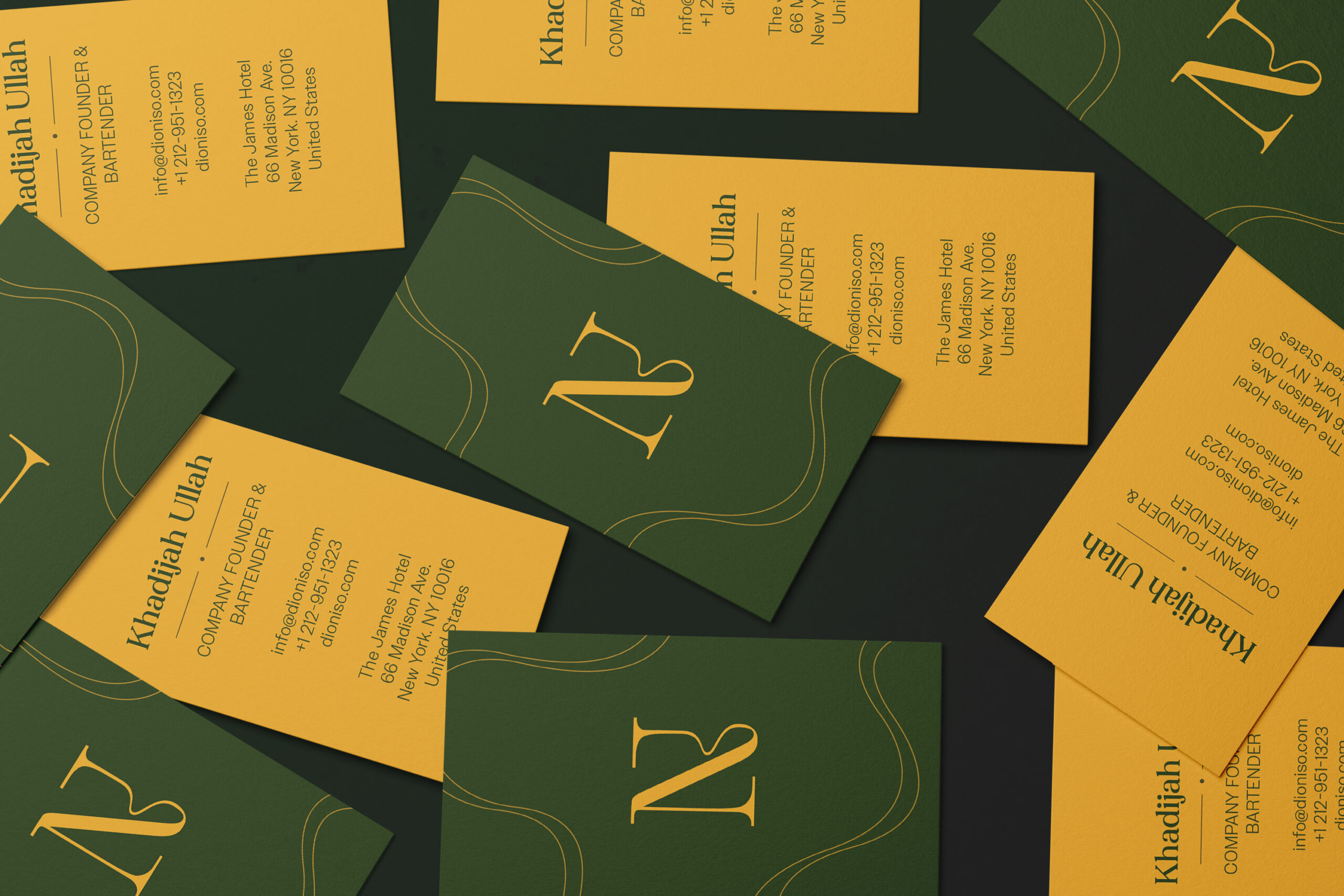
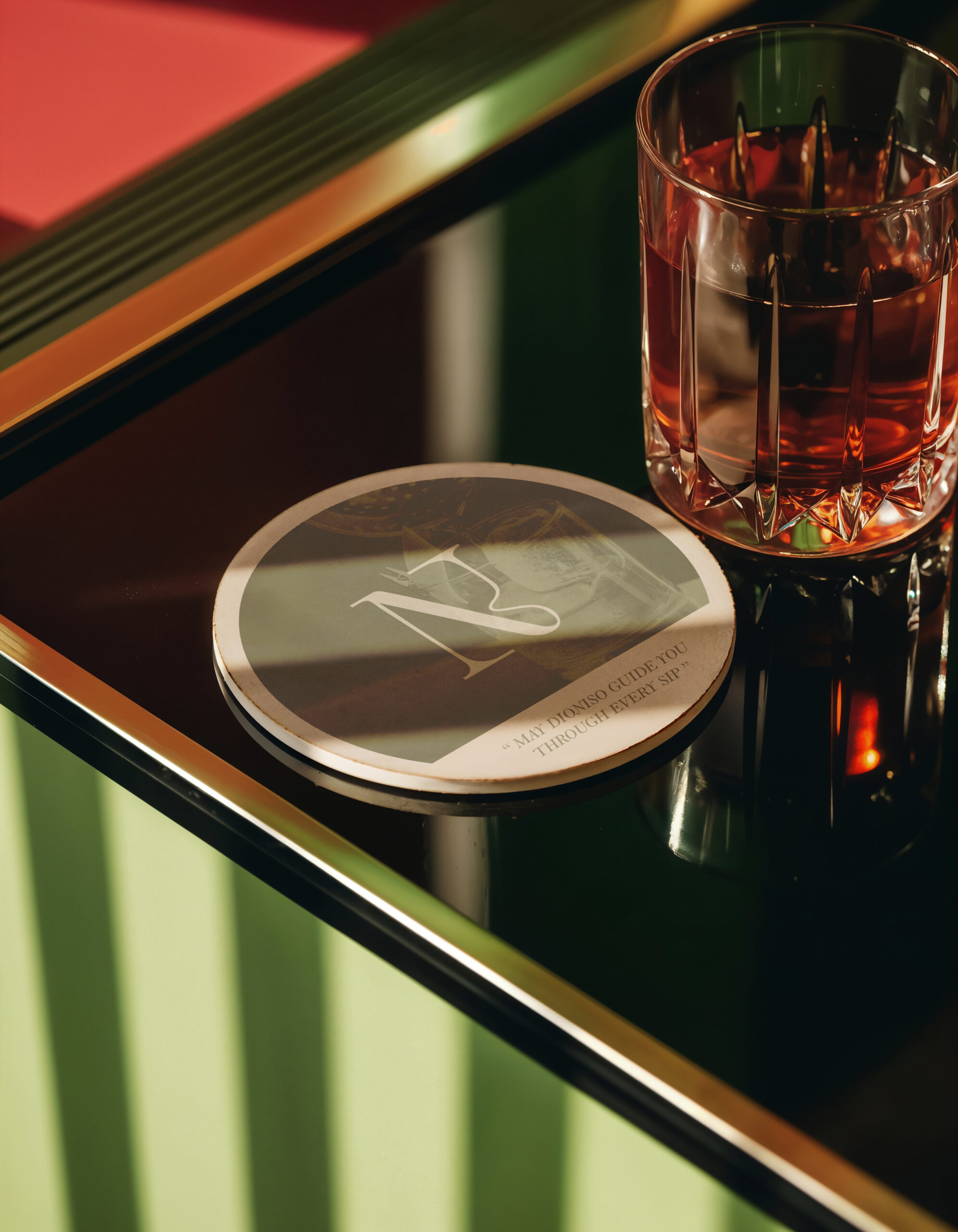
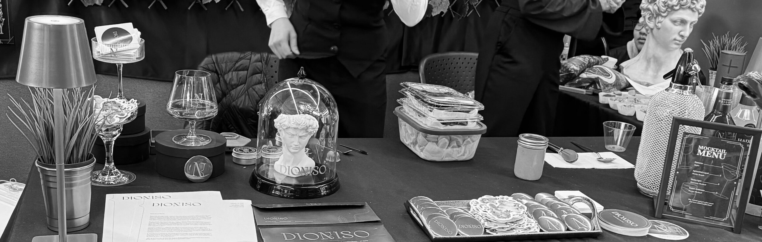
Dioniso is a high-end Italian-Greek themed cocktail lounge that caters to middle-class adults ages 25-60. It is a luxury lounge that offers a quality experience while sipping flavourful cocktails. They specialize in smoked cocktails to offer a multi-sensory experience, combining their wide variety of flavoured smoked wood chips with the best of alcoholic beverages.

Colour Palette 

The colour palette was selected from an image and later modified through our logo and moodboard design process. The greens were selected to reflect the vines that are often incorporated in the Greek art of Dionysus, while warm yellow represents the luxury feel of gold. Dioniso’s use of green can also be interpreted as something that is environmentally sound, as green itself represents nature, health, and life.

Logo Process

In designing the logo, I aimed for something elegant, high-end end and eclectic. Here, the oval submark was designed by Jennifer. The submark of the letter N contains a subtle swirl that was part of the original typeface Kondo, and was kept to represent the smoke from our smoked cocktails, as well as the feeling of delight when drinking. It also represents ivy or vines, often seen in Greek artwork of Dionysus.


We continue to express this swirl through thin, smooth, curved lines across our stationery, business cards, and promotional items. I designed the business cards and custom pins for employees and customers.

Stationary Items

Promotional Items

Brand Expo

All of our work culminated in the Brand Expo, a special event allowing us to present our brand and product through an effective booth and display setup. This was a memorable experience as our team won the department vote for best booth!