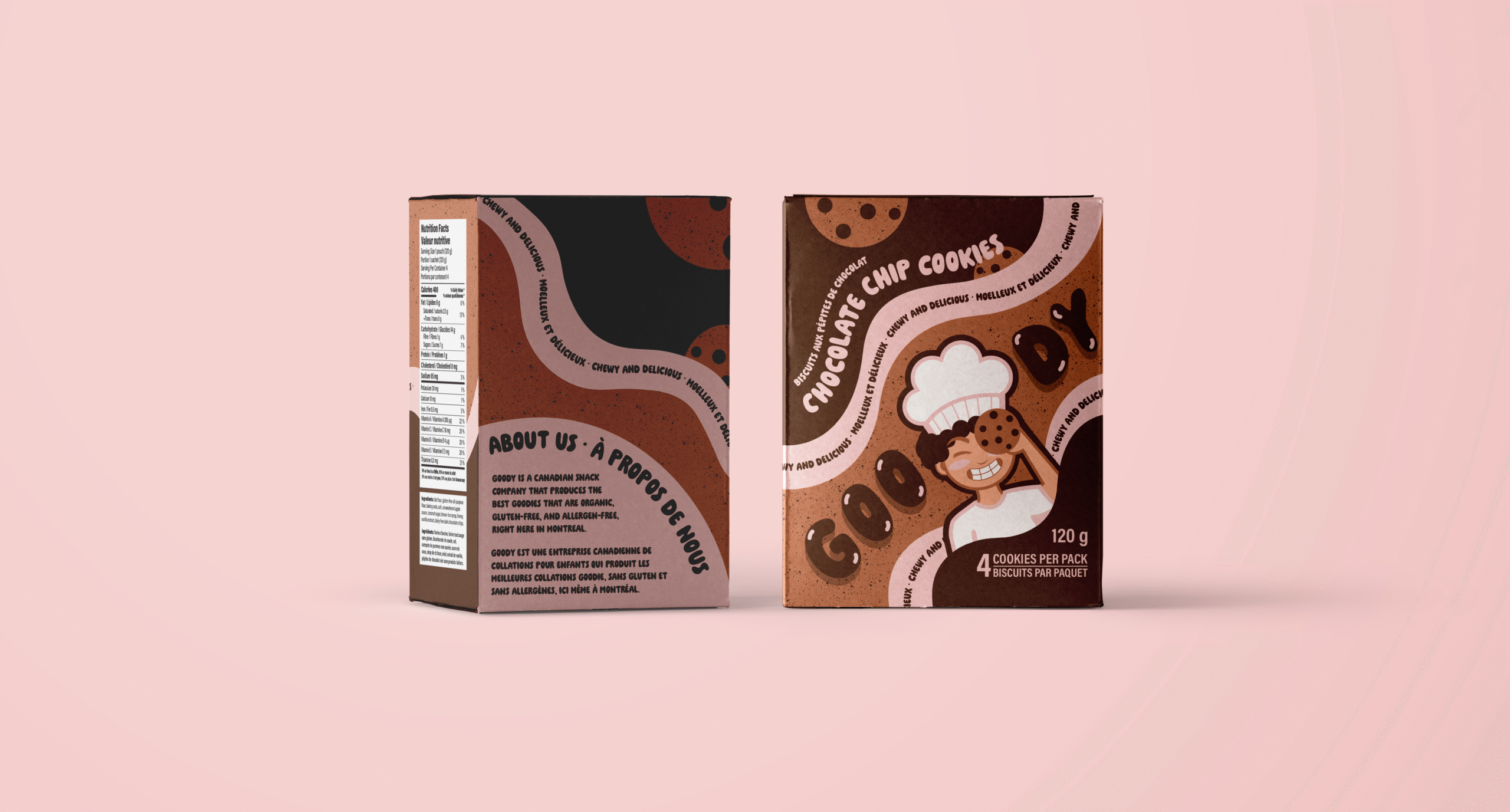
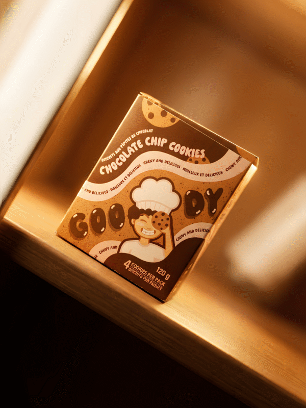
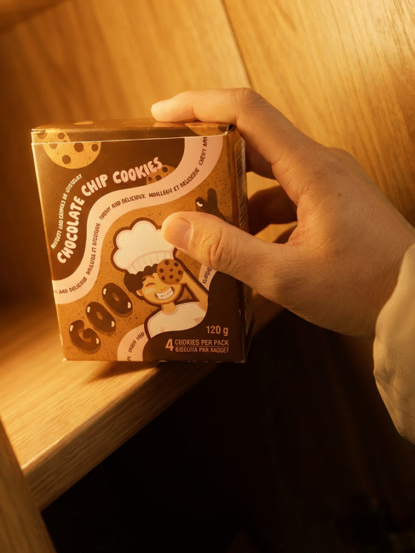
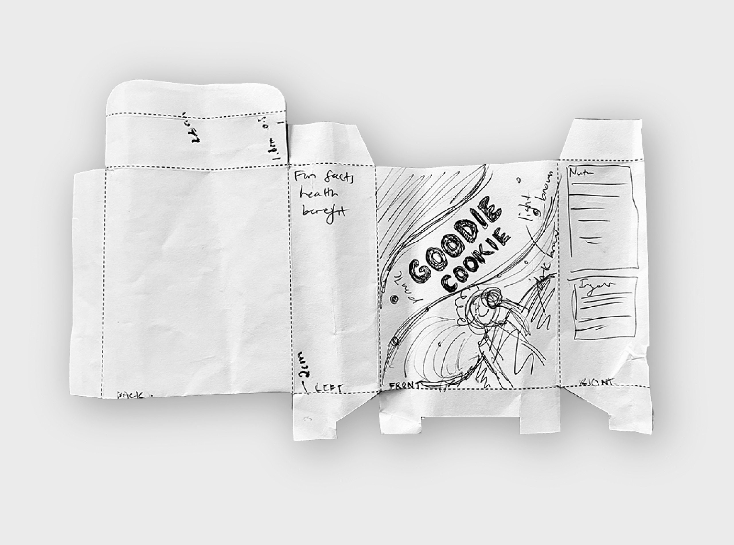
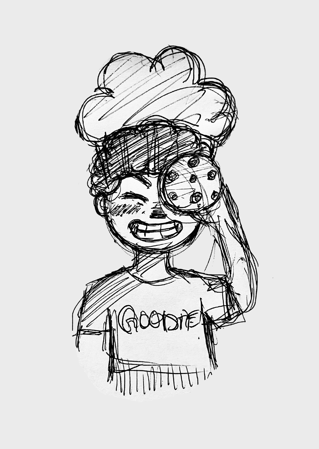
The colour palette includes a light brown representing the base colour of the cookie, dark brown for the chocolate chips, and a warm light pink to bring out a friendly and approachable feel as not to make the browns too earthy and raw. The organic curvy shapes reflect the softness and texture of the cookies. The illustration of the young boy chef adds a touch of playfulness which can create a memory-like connection between a child and the character, just as we do with cereals (for example, the tiger from Frosted Flakes).
Other aspects of the design include the use of a cookie-like texture across the packaging to avoid the classic flat vector packaging and bubbly typography to enhance the product’s targeting towards children. Overall, my packaging design aimed to apply the current trend of the maximalist style by using a warm colour palette and engaging visuals.