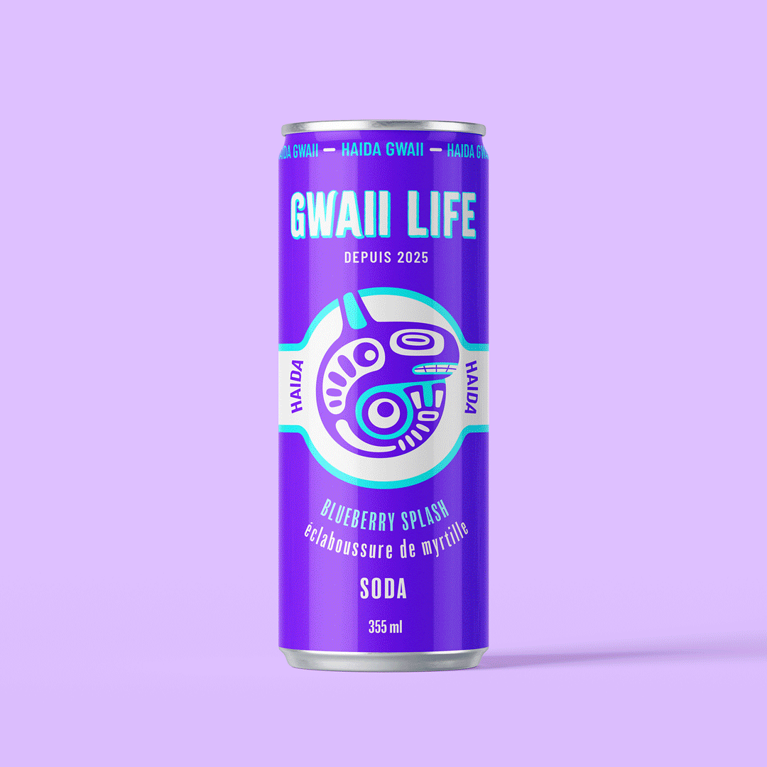
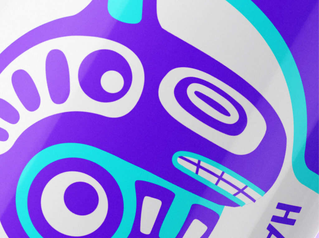
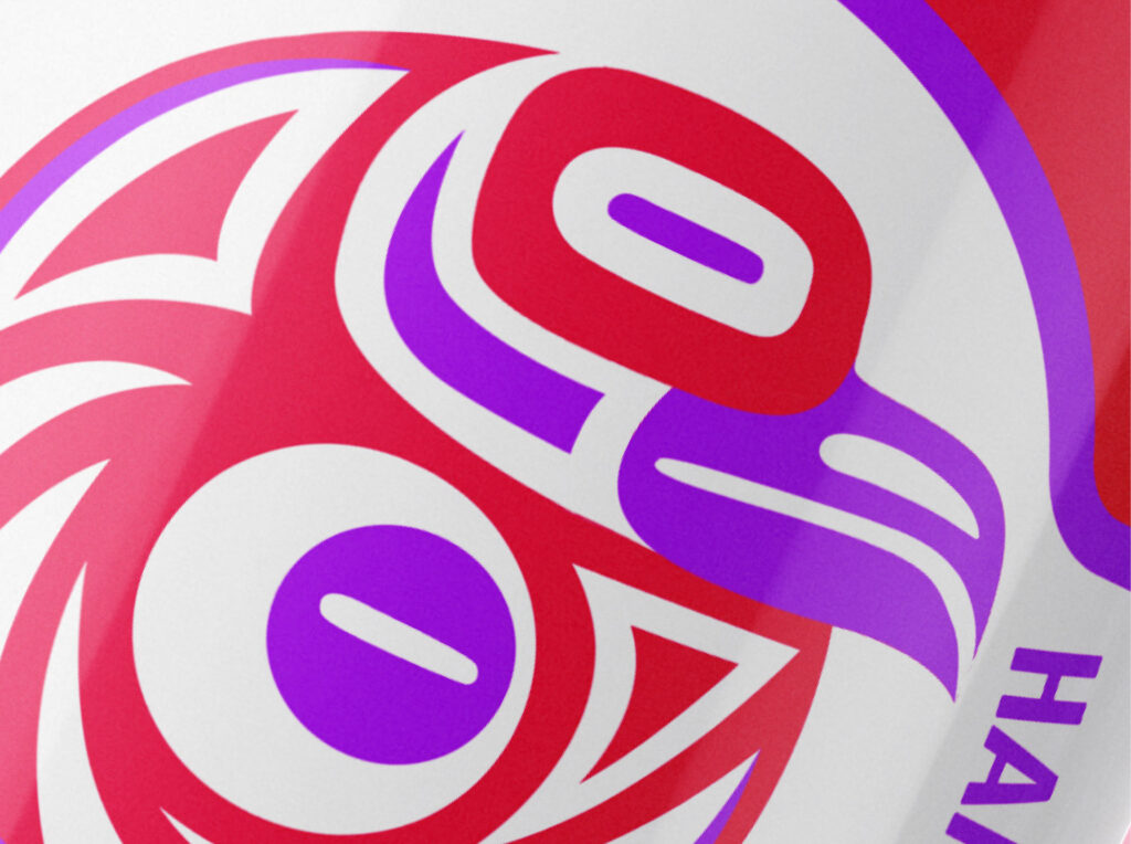
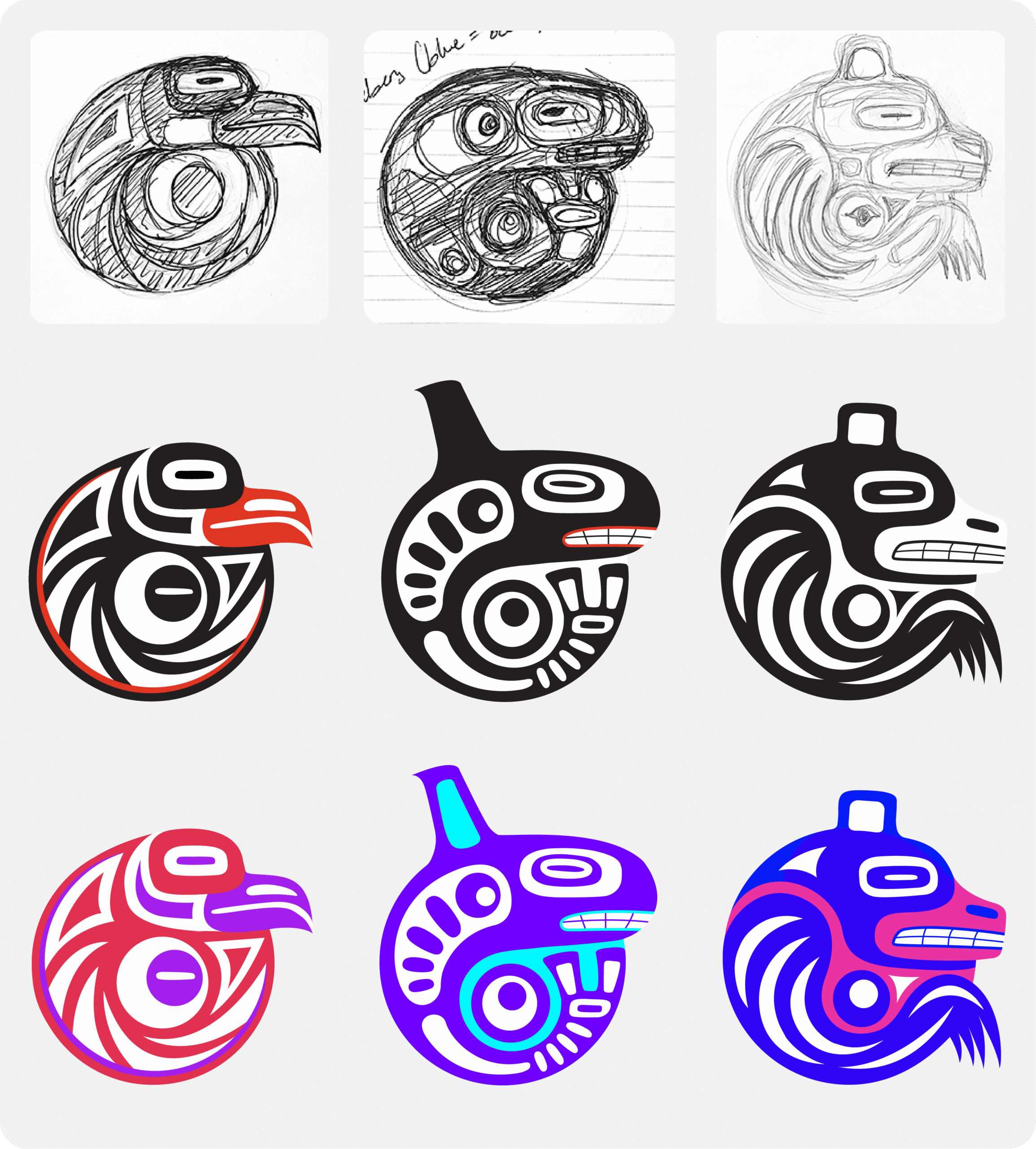
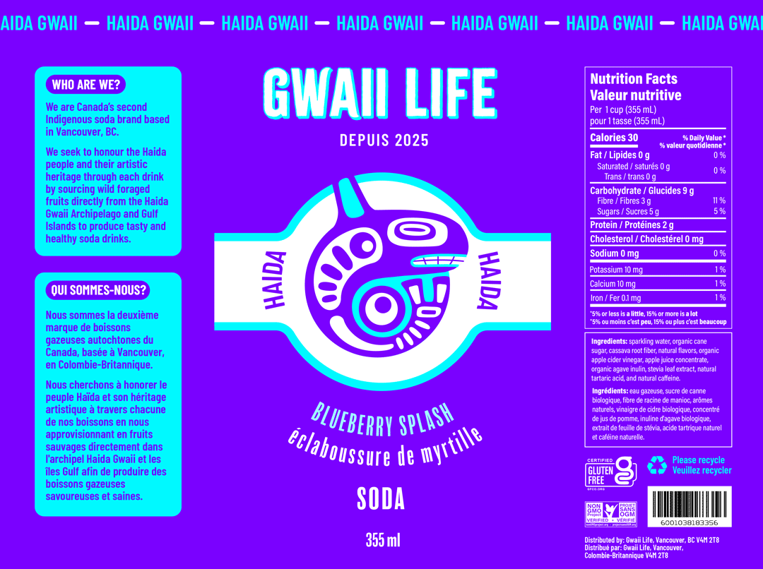
Gwaii Life
8387
wp-singular,portfolio_page-template-default,single,single-portfolio_page,postid-8387,wp-theme-bridge,wp-child-theme-bridge-child,bridge-core-3.3.4.4,qi-blocks-1.4.6,qodef-gutenberg--no-touch,eio-default,qodef-qi--no-touch,qi-addons-for-elementor-1.9.5,qode-optimizer-1.0.4,qode-page-transition-enabled,ajax_fade,page_not_loaded,,qode_grid_1400,footer_responsive_adv,qode-content-sidebar-responsive,qode-overridden-elementors-fonts,qode-smooth-scroll-enabled,qode-child-theme-ver-1.0.0,qode-theme-ver-30.8.8.4,qode-theme-bridge,qode-portfolio-single-template-7,elementor-default,elementor-kit-6892,elementor-page elementor-page-8387

Indigenous based soda company 

Gwaii translating to island in the Haida language was chosen as a reference to the Haida Gwaii; the archipelago in which the Haida people once resided in British Colombia.

Project Brief

I was tasked with designing and producing three bottle labels under one product line that each enhance a flavour while integrating one element from pop-culture. The labels also required translation of both English and French, with industry standard requirements of providing the NFT, ingredients, quantities, warnings on allergens etc.

Design Process

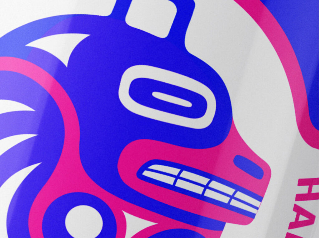
Before beginning this project, I took inspiration from the American soda brand Poppi, who produces clean, minimalist style soda cans, combining simple illustration with eye catching colour harmonies. Similarly, I applied their usage of striking and high contrast colours by using highly saturated analogous colour schemes.

Illustrations

I illustrated three animals for each flavour: an eagle, killer whale, and bear. I browsed through many artworks representing Haida art and recreated my own style of it while following their formline system. My illustrations are supposed to bring out the lively, powerful yet meaningful sodas. What sets my design out is how much it stands out from any other can you’d see at a grocery store.

Software

Adobe Illustrator
Adobe Photoshop